Accessibility
Accessible Patient Survey
An online patient survey built so that going digital does not exclude the elderly and disabled people it exists to reach.
In progress
This case study is not finished yet. There are gaps in it, several images are still missing, and some parts may contain mistakes or unclear information. I am working on it.
Context
Is the internet really accessible to everyone?
I designed an online survey that asks heart patients about their care and after-care once they have been through a cardiac-catheter procedure, a stent, or a balloon dilation. The institute behind it runs statutory quality checks for doctors’ offices and hospitals, so the answers feed back into how these patients get treated.
The difficulty sits in who has to answer. These are people recovering from heart surgery, many of them over 80, some of them blind, some with other disabilities.
Outcome
- 24People tested with, older patients plus a blind screen-reader user
- 4 ways inStandard, high contrast, German Sign Language and Leichte Sprache
- BITV 2.0Built and audited to it, alongside WCAG 2.2 AA
- 3 controlsContrast, text size and language, in the header from the first second
Problem
The survey used to reach patients on paper and by email. For a lot of them that was uncomfortable. A printed questionnaire arrives weeks after the hospital stay, has to be filled in by hand, and has to be posted back. An email asks people to manage a link and a login on whatever device they happen to own. Moving the whole thing online sounded like the obvious fix.
It is not that simple. When the people answering are mostly elderly, and some cannot see the screen at all, going digital can quietly shut out the exact group whose feedback the survey exists to collect. I started this project assuming the web was already a fairly accessible place, and three months of measuring it taught me otherwise. A contrast ratio that misses by a hundredth, a menu that traps a keyboard, or a language attribute set to the wrong value can each end someone’s session before they answer a single question.
How might we
move a statutory survey online so that going digital does not exclude the people who most need to answer it?
Solution
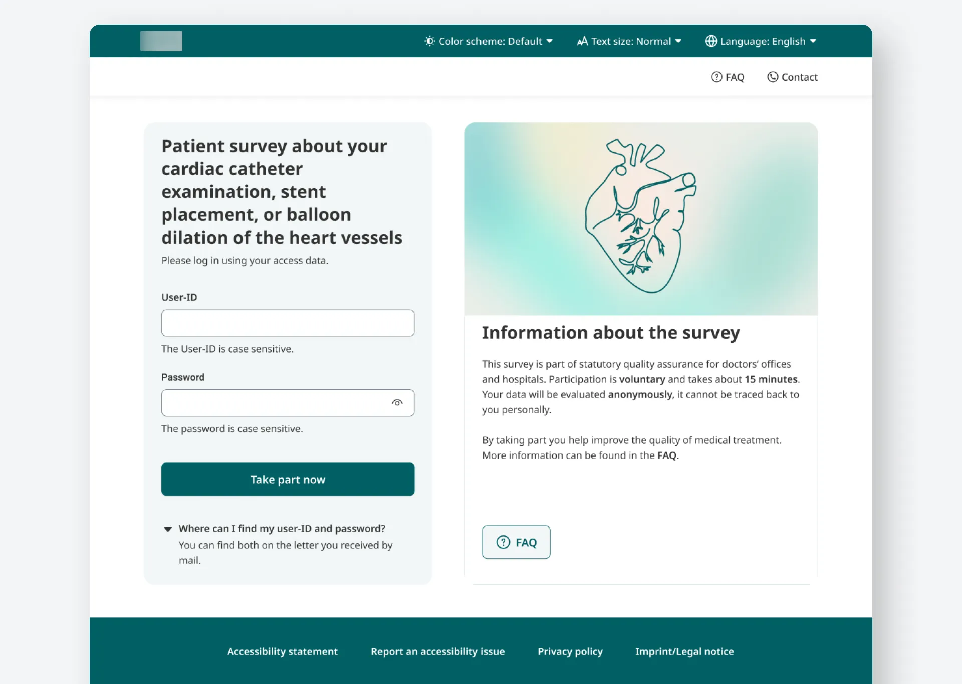
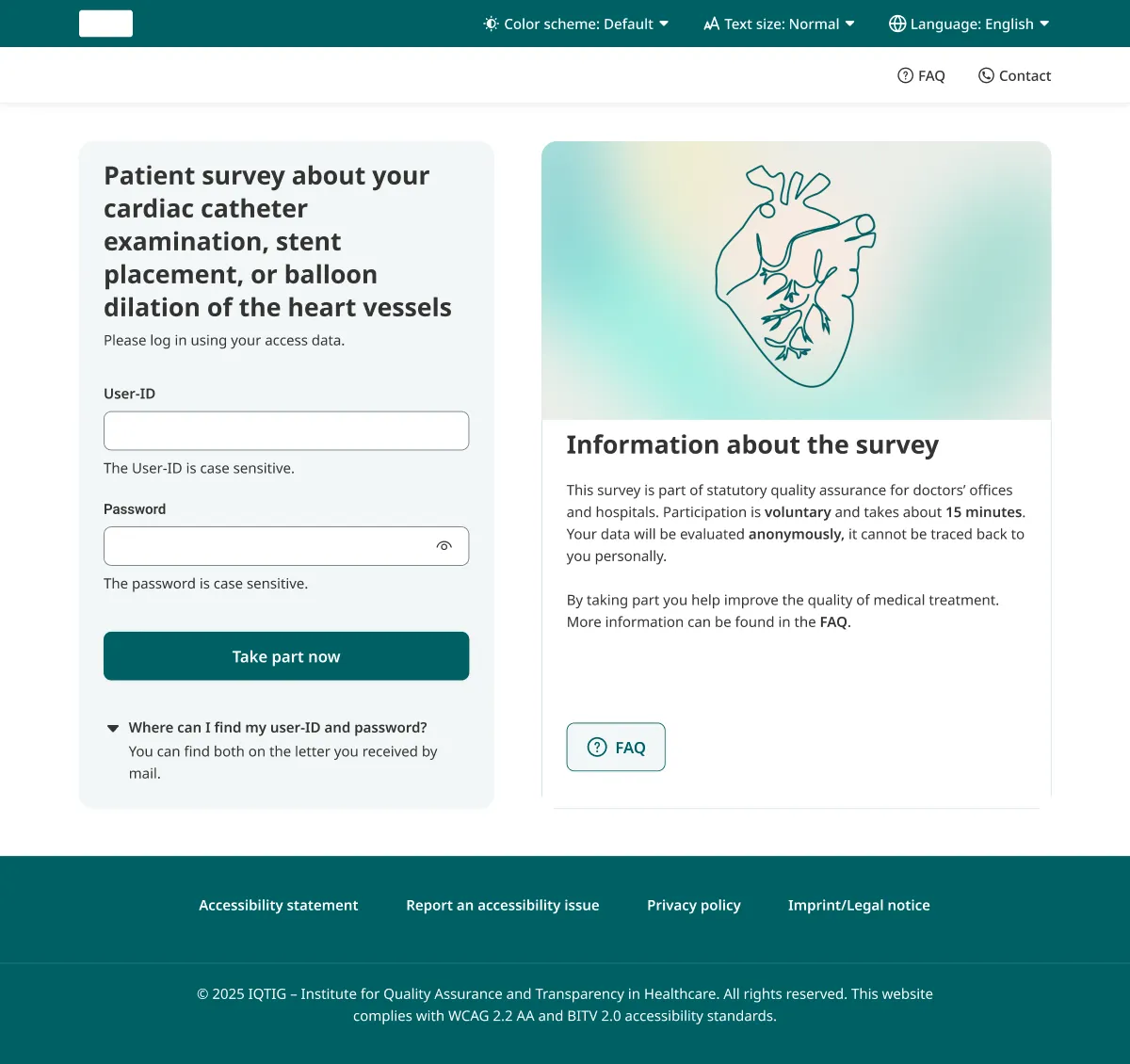
I built an access page and a surrounding platform around one rule: a person should be able to bend the page to their own needs before they do anything else.
The platform offers a contrast control with a true dark high-contrast mode, an adjustable text size, a language toggle between German and English, a German Sign Language video version, an easy-language version following the Leichte Sprache standard, support that works with a keyboard and a screen reader, and a form for reporting any barrier a user still hits. The controls sit in the header, in reach from the first second.
Research
Twenty-four people, and what they broke
The first round was eight older participants and, separately, a blind participant using a keyboard and a screen reader. Testing carried on from there and reached twenty-four people in total. One woman in that first round was 88 years old. She was sharp and fast, and she kept worrying about other people.
I can do this, but my friends would not.
That worry came up again and again. Older users were afraid of the jump itself, from a paper habit to an online one, more than of the screen in front of them.
Three findings changed the design directly.
The contrast and text-size settings did not survive the login. A user would set dark mode on the access page, log in, land on the questionnaire, and find the questionnaire back in light mode. The setting lived in a cookie the survey side had not yet read. For someone who needs high contrast to read at all, that is the session over.
People reached for the browser’s back and forward buttons at the end of the questionnaire instead of the ones we had built into the page, and the browser navigation did not always hold state, so answers could slip.
The blind participant could not open the language switch with the keyboard. Tabbing to it never revealed the menu. The language attribute on the English option was also wrong, so the screen reader announced the wrong language for both choices. I had spotted that attribute bug myself the night before. Watching it block a real person is a different kind of evidence.
Design
How the access page found its structure
The access page started from a borrowed sign-in template that still said “Your Logo” and “Lorem Ipsum”, with social-login buttons for Facebook, Apple and Google. None of that belongs on a statutory health survey, and the template was still a fast way to test layout. The accessibility controls came in next along the top, and then I stripped out everything that did not fit. A patient here types a code from a letter that arrived in the post.
One small change came straight from testing. The control had been labelled “Farbschema”, or colour scheme. Users read past it without understanding what it did. I renamed it “Kontrast” and the meaning landed.
The early layouts ran the login across the top and pushed the survey explanation underneath, where it landed below the fold on a laptop. A patient could open the page and never learn what the survey was for, which is a poor start when taking part is voluntary. I split the page into two columns so both sit in view at once.
The right panel started as plain text and read as a wall. I tried an ECG trace, then a stethoscope photo. Both were too busy, because the ECG is a grid of thin lines and the stethoscope photo sits on printed paperwork. The version I kept uses a simple line drawing of a heart. It carries the meaning, holds its contrast, and stays calm next to the task.
I also stopped placing username and password side by side. Stacked in one column, each field has its own label and hint with room around it, and the desktop now matches the phone.
Design
Choosing a high-contrast mode by measured ratios
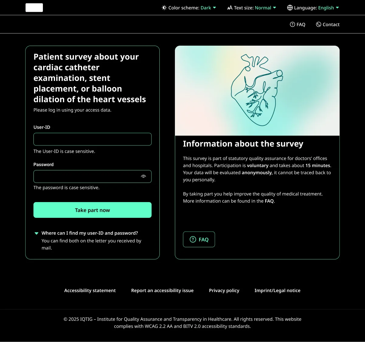
High contrast is not one thing. I drew several full themes and measured each: yellow on black at 8.83:1 and again at 16.02:1, a green scheme around 14.55:1, a red-tinted scheme at 14.78:1, and a dark green that came out at 16.65:1. The frames still carry those ratios in their names. The ratio decided each one.
Yellow on black is a scheme many low-vision users already rely on, so it earned its place through real use on top of the ratio. The final platform ships a light theme plus the dark high-contrast mode.
Design
The illustration nobody needed to move
We argued about the heart illustration on the access page, and one version animated it. We kept the static one. An animation pulls the eye and competes with the task, and for users sensitive to motion it becomes a real obstacle. The still drawing carries the same meaning and asks nothing of the reader.
Audit
Fixes that came from the review
A BITV 2.0 and WCAG 2.2 AA review caught the contrast values that were close but short. The error-message red measured 4.48:1 against the card it sat on, just under the 4.5:1 line, so I darkened it to 5.92:1. The placeholder grey was failing too and went to 7.27:1, into AAA. The worst case was the “sending” state on the submit button at 1.8:1, white text on a button that turned pale while loading, and that became a dark loading colour at 9.18:1.
I fixed all of these in the colour tokens, so one change carried across every page that used them.
Design system
Legibility first
Underneath the pages sits a small system built for legibility. Every part of it had to hold up in the dark high-contrast mode and at a larger text size.
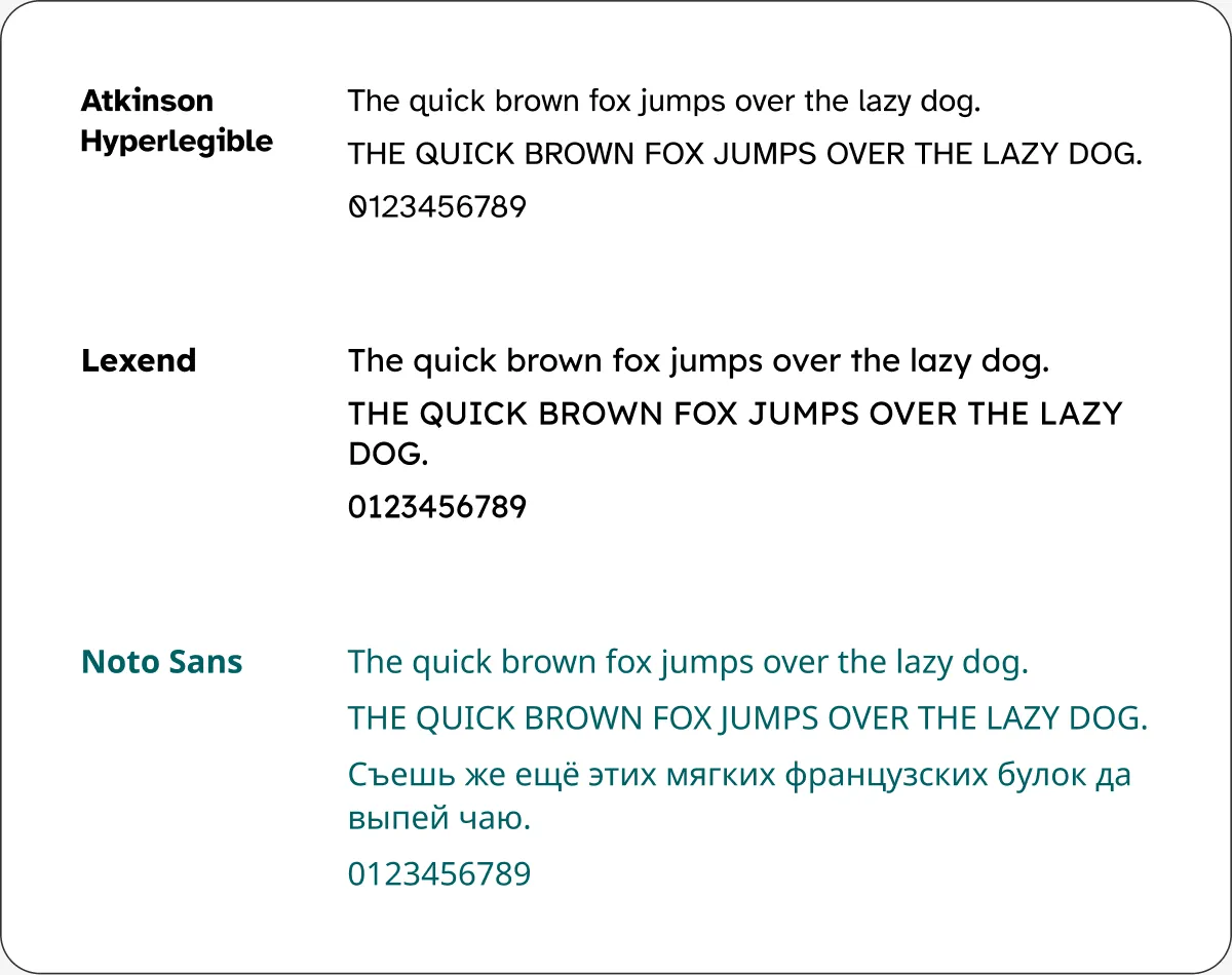
The typeface was the first decision. I compared three families made for easier reading: Atkinson Hyperlegible, which the Braille Institute drew for low vision, Lexend, and Noto Sans. I set the same sentence in each and looked at the shapes that usually trip people up, the lowercase a and g, the figure zero, the spacing between letters. Noto Sans took the role, because it stayed clear at small sizes and covered the widest set of languages and special characters, which a multilingual survey needs.
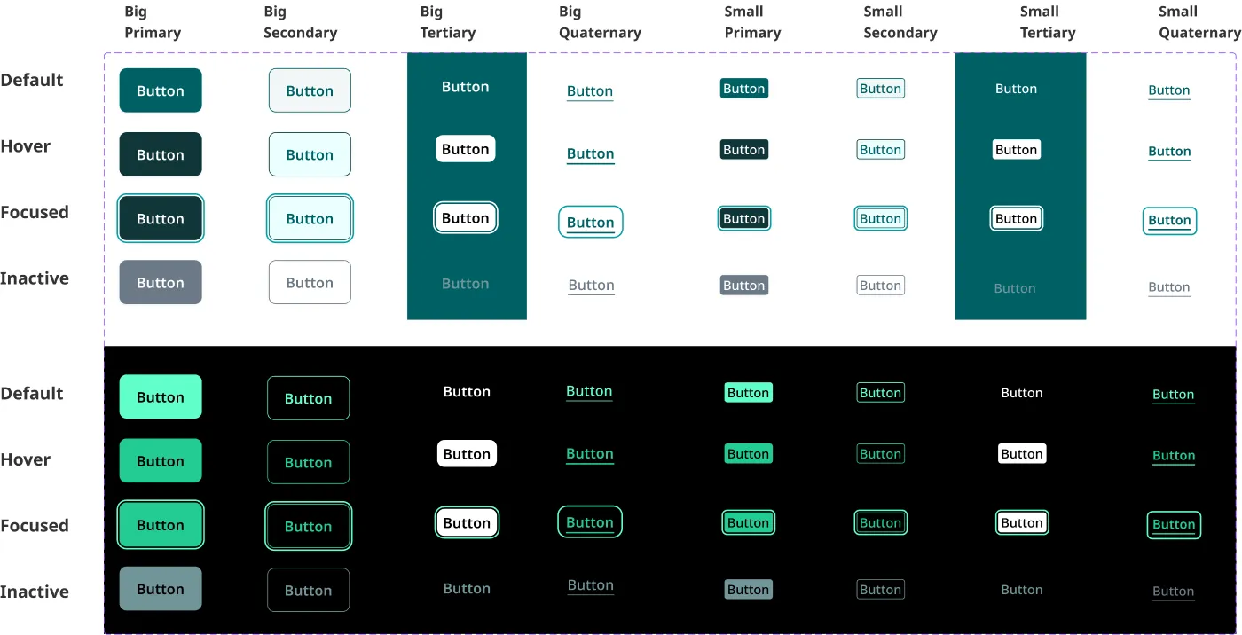
The buttons are where the accessibility work is easiest to see. Every button exists in four hierarchies, primary through a link-style quaternary, in two sizes, and in four states: default, hover, focused and inactive. The focused state carries a clear ring, because a keyboard user has to see where they are, and the review had flagged focus outlines getting cut off. I drew the whole matrix twice, once for light and once for the dark high-contrast theme.
For the icons I lined up candidates side by side, including the official marks, and chose line icons that stayed legible when small and when recoloured for high contrast. The official coloured badges, including the DGS badge for German Sign Language, carry fixed colours that do not survive the switch to dark mode, so they stayed in the research.
Building blocks
Several parallel ways into the same content
A German Sign Language version presents the survey information as video, for deaf users who read sign more fluently than written German. An easy-language version rewrites the same content in Leichte Sprache, for users who struggle with dense official German. A barrier-reporting form lets anyone tell the team about an obstacle they hit, which matters because no audit catches everything a real user will.
Reflection
The platform ships a light theme and a dark high-contrast one measured at 16.65:1, a text-size control, a German and English toggle, a German Sign Language video version, an easy-language version in Leichte Sprache, keyboard and screen-reader support through the whole flow, and a form for reporting any barrier a user still hits. The contrast fixes from the audit sit in the colour tokens, so the error red, the placeholder grey and the button loading state carry their corrected ratios on every page. Testing with the older users was mostly positive, and the dark mode in particular found fans, including one man who switched to it because he had read it was easier on the eyes.
Some of the strongest findings sit on the developers’ side now. The contrast and text-size settings still need to carry across the login into the questionnaire, and the keyboard path to the language switch plus that language-attribute bug need the fix I flagged. The audit-driven contrast values are done in the design and handed over with the reasoning attached.
Takeaways
The web is not as accessible as it looks, and the gap is rarely dramatic. It hides in a 4.48:1 that should be 4.5:1, in a menu a keyboard cannot open, in a setting that quietly drops at a page boundary.
Measurement got me part of the way. I found the wrong language attribute myself the night before the session, and I had it filed as a small bug. Watching the blind participant hit it and stop told me what it actually cost. The settings dropping at the login read the same way to me, like a handover detail, until someone lost their high-contrast view halfway through a task.
The 88-year-old finished the survey quickly and spent the rest of her session worried about her friends. Those friends are the people this survey has the hardest time reaching, and they are the reason the online version has to work without anyone sitting beside them.